An easy method to monitor and control a process average. It is an alternative to the Shewhart control chart.
Pre-control charts work well with stable and slow process drifts or changes. These charts provide a means to monitor a process and act as a guide for process centering.
They are easier to setup, implement, and interpret the Shewhart charts.
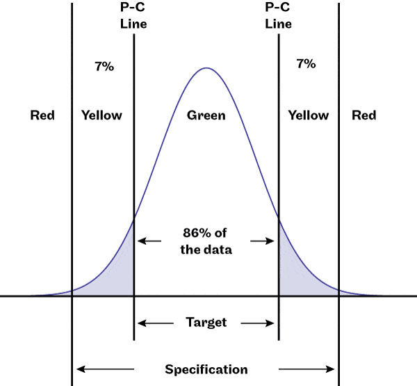
The basic idea is to divide the specification range into zones.
The P-C lines are half way between the center of the specification range and the limits. If the process creates items described by the normal distribution and the Cp =1, the zone between the P-C lines contains 86% of the data. Each yellow zone, from the P-C line to the specification limit contain 7% of the data, leaving less than 0.15% for each red zone.
When the Cp >1 the probability of the data landing in the green zone increases, assuming the data remains centered.
The pre-control chart does not rely on the data being normally distributed, yet works will when the data is normal and the target is centered within the specification limits. The zones are created based on the tolerance range and do not require a control chart or control limits.
The diagram a pre-control chart. In practice add the values of the specification limits and P-C line values.
Consider that the chance for a part measurement to be in either of the yellow regions is 14%. Thus for two parts to fall sequentially in the yellow region is (0.14)^2 = 0.49. This means there is a 1 in 49 chance that two items will have measures in the yellow region sequentially.
If two items fall in the same yellow region the mean most likely has shifted and you should center the process. If the two items are in the different yellow regions, it indicates the variation has increased and you should take steps to minimize variability before continuing with production.
A single measure in the red region indicates a less than 1 in 100 chance of occurring, or a 99 in 100 chance that either the mean has shifted or the spread has uncrossed or both.
Again, take steps to correct the process before continuing operation.
Use the following rules with a pre-control chart:
Set-up
- Run and measure five items in a row.
- If all five are in the target (green) zone the job is OK to continue.
- If any one or more items are not in the green zone, adjust the process and run five more items.
Running
- Sample and measure two consecutive items.
- If the first sample is in the green zone, continue running and do not check the second sample.
- If the first item is outside the green zone, check the second item.
- If the second item is on target, continue running.
- If the second item is outside the target region, adjust the process and go back to set up.
- Any time a reading is out of specification (red zone), stop, adjust the process and go back to set up.
Note: take a sample every 25 items. If production is small or the cost of out of specification parts is high do 100% sampling and adjust the process when two consecutive items fall outside the green zone. For high volume runs, relax the sampling frequency- after 25, check that are all green. Tighten the frequency if the there are items in the red or yellow zones.
The frequency of sampling should be more often for critical parts with high cost or cost of failure and can be less often for less critical parts or processes with a track record of stability.
The actual frequency for sampling is every 25 items produced. This is just a starting point and adjusts to meet your production volume and risk of having to recheck previous items when process adjustments become necessary. For example, if the cost of segregating and inspecting 25 units is prohibitively expensive, then sample more often.
Related:
Selecting Control Charts (article)
8 Steps to creating an X-bar and s control chart (article)
Process Capability (article)

Shewhart control charts fails in detecting small shifts in the process. So, we can use CUSUM (Cummulative Sum) charts as a complement of Shewhart control charts. I encourage the reader to read about CUSUM charts. 😉
Hi Wilmer,
Thanks for the comment, and you are right that each chart has limits. I agree CuSUM is more sensitive, and it’s more difficult to implement.
Cheers,
Fred
Can you share any example of pre-control chart for unilateral tolerances.
Hi Mohanish,
good questions and I do not have an example to share – I do not know for sure, yet I would suspect you could just build a regular pre-control chart and ignore the side that is without a tolerance. Maybe sort out the math so that you can check if the various red, yellow, and green regions account for the same probabilities.
cheers,
Fred