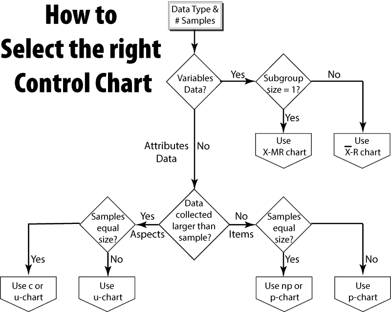
Consider a handy flow chart and set of descriptions that will assist you in selecting the appropriate control chart, or at least understand the differences.
What is a control chart?
Control charts are the central tool for statistical process control (SPC). Control charts permit us to graphically and in real-time understand the stability of the process. We make measurements and with simple plots can notice meaningful shifts in the process.
Changes in a process can be adverse (out of control) and indicated something in the process may need correction. A change may also be beneficial. In this latter case, we may want to investigate the cause of the change and improve the process.
Look at the data
Selecting the right plot is the second step in using control charts. The first step is to determine what to measure and the nature of the data. Once we know if the data is:
- variable or attributes data (continuous or count), and
- the size of the sample collected,
we can select the appropriate control chart using the flowchart.
At the moment the chart does not include all forms of control charts. There are specialty charts for use in unique situations, such as the X̄ – s chart for when we can calculate the sample standard deviation. Other types of charts include the EWMA chart, CUSUM chart, time series model and regression control charts.
The basic flowchart will get us started in the selection process. Understanding each type of chart and when and how to use it will refine the selection. With practice, you will be able to quickly determine the appropriate control chart and start making process improvements.
Types of Charts
This is a short description of the basic control charts. Including notes on when the particular chart is advantageous and a few assumptions to consider.
X̄ – r chart
Used to monitor variables data with regularly collected samples. The chart is useful when:
- The sample size is greater than 1 and less than 10.*
- The sample size is constant.
- A person manually does the calculations (range is easier to calculate than the standard deviation).
*With over ten samples for inspection use the X̄ – s chart as using standard deviation rather than range provides additional sensitivity to changes.
There are two parts to this chart. The first monitors the process mean and the other monitors the process variance using range as a surrogate for standard deviation.
Assumptions
The X̄ – r chart relies on the sample data being normally distributed. Using a sample mean has the advantage of the central limit theorem which allows sampling from a process that is not normally distributed, and the samples are ‘normal enough’ for the analysis to work.
The sample data is being drawn from a single distribution and it is stable. We are looking for changes of a stable process.
The mean and range of each sample does not depend on the values of any other sample. Each sample is independent.
X-MR chart
The X – MR, or X Moving Range chart is also known as the individuals and moving range or Shewhart individuals control chart. The chart permits monitoring variable data when it is impractical to use rational subgroups (sample size of 1). Plan on using this chart with variable data when:
- Automation permits inspection of each unit (100% inspection).
- Production is too slow to gather a meaningful group of samples.
- Measurement error dominates the differences between individual readings of a sample. This occurs when the process produces homogeneous batches (e.g. chemical production).
- The data does not have to be normally distributed.
Like the X̄ – r chart, the X – MR chart consists of two charts. One for the individual readings and the other for the moving range which is the difference between the last reading and the current reading.
Assumptions
The X – MR chart does not assume the data is normally distributed or is from any distribution. Thus, this approach is very robust and works with highly non-normal data.
c chart
Count or c chart works with attribute data when counting defects or nonconformities (aspects) per unit. For example, counting the number of paint blemishes, or the number of solder joints requiring repair per circuit board. There can be more faults than samples. The sample size is greater than one and constant.
Assumptions
The c chart relies on the Poisson distribution and can be appropriately used when:
- The potential for nonconformities is very large. For example, the paint on a car is a very large area and defects can be very small.
- The possibility of a single defect is small and constant.
- The sample inspection process is consistent from sample to sample.
u chart
The u chart monitors attribute count type data when the number or size of inspection units may vary. For example, this chart may be suitable when:
- Monitoring raw material received when the lot size varies.
- Monitoring the number of parking tickets issued per day.
- Monitoring production when product size varies.
Assumptions
The u chart relies on the Poisson distribution and can be appropriately used when:
- The potential for nonconformities is very large. For example, the paint on a car is a very large area and defects can be very small.
- The possibility of a single defect is small and constant.
- The sample inspection process is consistent from sample to sample.
p chart
The p chart monitors the proportion of nonconforming units in a sample. The individual unit inspections result in a pass/fail (attribute data). This approach does need more than one unit per sample and a method to determine if each unit meets requirements or not.
The sample size does not have to be constant yet is large enough to expect at least one failed unit in order to minimize false alarms. If possible to make measurements that are variables data use the (bar X) R or MR charts as they provide increased sensitivity to process changes.
Assumptions
The p chart relies on the binomial distribution and has the following assumptions:
- The chance of failure for each unit is the same, p.
- Each unit is independent of other units in the process.
- The sample inspection process is consistent from sample to sample.
np chart
The np chart is a modified p chart. By multiplying the proportion, p, by the number of samples, n, the chart plots the number of the nonconforming units instead of the proportion nonconforming. This may be easier to interpret.
The np chart does require a constant sample size, n.
Assumptions
The np chart relies on the binomial distribution and has the following assumptions:
- The chance of failure for each unit is the same, p.
- Each unit is independent of other units in the process.
- The sample inspection process is consistent from sample to sample.
Related:
Introduction to Control Charts (article)
Variables Control Chart Background (article)
X BAR AND R VALUES FOR THE 10 SAMPLES OF TEA CONTAINING 30 PACKETS
X Bar
320
310
330
360
290
280
340
320
360
300
R
12
16
14
18
22
23
10
13
27
25
Jhilimil Tea company has a packaging machine which pack tea in plastic packets, to ensure consistent quantity in each packet a sample of 30 packets were taken per hour in a day and its mean and range is recorded. Around 10 such sample were taken per day. from the following data answer the following questions.
Answer Section
Q.No 1: omment on the type of data being collected, which control chart is appropriate for the data and why.
Enter …
Choose file
File Name :
Save & continue
Q.No 2: what are the values for Central Line, Upper control limit and lower control limit, also show the entire calculations for the response
Enter …
Choose file
File Name :
Save & continue
Q.No 3: What are your interpretations for the above samples, can we accept that the system is in control, give justification for your answer.
This looks like a homework problem… which you should sort out given the resources available to you. None of these questions are particularly difficult for someone familiar with SPC control charting. Enjoy the adventure learning about SPC as it is a great tool to master. cheers, Fred
Can i have the answer of these following question (jhilmil tea company)
Should i use xbar r chart or xbar s chart in this tea packet study caae?
Given the problem statement and provided data you have to use the R chart, as you are not given the information to calculate the standard deviations.
In practice the S-chart is better as the range calculation is a crude estimate of standard deviation.
Cheers,
Fred
So sir…should i use A2 value of 10 ? …as 30 is also given its confusing?…while calculating ucl…
Like if i am calculating UCLr… then i should use D4 value of 10 in this question and 30 has nothing to do with this question ….correct??
I agree the question is confusing. 10 samples per day with each sample containing 30 items… at least that is how I read it.
Check out https://lucas-accendo-site-speed.sprod01.rmkr.net/8-steps-to-creating-an-x-bar-and-r-control-chart/
for the process to create these charts.
Cheers,
Fred
Sir the only reason i keep on asking you is …you are so generous as you do reply ….sir just one question…should i use n as 10 or 30 in above scenario…..can i use D4 value of 10 for calculating ucl….or 30…and if yes what should be the d3,D4 value of 30….i m just learning…i am novice…plz advise me
Hi! I work in healthcare facility and we count the number of patient visiting Emergency Department, which control chart would be applicable to use in this case and what is the classification of these data.
Thx for your care
HI Maher,
A count of arrivals per some duration would simply be count data – attribute and it would be possible to have more arrivals then one duration say an hour or day — so I would recommend the u-chart.
cheers,
Fred
Nice